Working with TTRPG Artists: Iliadele Interview and Jukebox Cover Case Study
Jukebox Journal (devlog)
TL;DR: I talk with Iliadele (Lia) about making the Jukebox cover art. We use the cover as a case study for working with artists, including: reaching out, writing art briefs, communicating on art iterations, and more.
This post is a blend of behind-the-scenes advice, a case study of the Jukebox cover creation, and an interview with the exceptionally talented Iliadele about their process and work as a freelance artist.
It covers:
Lia's origin story
Reaching out to artists
Writing an art brief
Communicating and co-designing the cover (with LOTS of in-progress pictures)
Lia's tips and experience from working as an artist in the games space
There are so many images that this post exceeds email length, but the read is worth it!
New Art Stretch Goal: Three New Art Pieces!
In addition, I'm excited to announce that Lia has agreed to create three more pieces of internal art for Jukebox. The stretch goal for this new art is $14,000, and it will be styled after Broadway and movie posters:


Going left to right:
The first image is an example poster I found in one of my playbills. The lone monochromatic figure on a black background with lots of stylized text is the basis for these new pages.
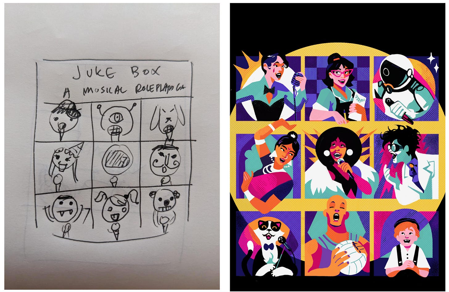
The middle image shows my stick figure sketches.
The final image is an example of the monochromatic color scheme and style we’re aiming for. This is a color wheel exercise Lia did last year. The figures in the Jukebox images will be a little more stylized and flatter than the characters there, with color schemes pulled from the cover.
We're headed into the final week for Jukebox. The game is a blast, and we've got so many talented folks writing playsets, from Wu-Tang wǔxiá to campy pop punk slasher to acoustic epic tales of gods and hubris. The Kickstarter prices offer a small discount on Jukebox for backers. Back today and help us hit these stretch goals!
And now, the interview with Lia!
Interview with Iliadele
About Iliadele
Welcome to the Jar of Eyes Game Gazette. With me today is Lia!
Hi, everybody! My actual name is Chiara Adele Papalia, but everybody but my mom calls me Lia. I’m an artist from Italy and have worked for two years now as a game artist and illustrator. And I've been collaborating with Lyla on the cover for Jukebox!
Lia drew an absolutely amazing cover for Jukebox. During this interview, we will explain the process of making the Jukebox cover. Lia will also share what it’s like working as an artist in the games industry.
What’s your origin story? How did you get into art, and what led you to games?
I've always drawn, but I wasn't really good until I was about 17. I've never studied art; I am completely self-taught. I didn’t go to art school because I didn't feel confident enough in my abilities to get in.
I went to a classical liceo, which means a classical high school where you study Greek and Latin literature. That filled my head with beautiful history and images. Then I went to the Politecnico di Milano, which has a very good design school. My education there helped me develop a structured method for collaborating with others and a design sense.
I got into games in university. I did this project with my professor, Maresa Bertolo, who is a game designer who studies how TTRPGs can help with mental health. It got me passionate about it because I realized how powerful games are as a means of communication.
Games allow people to find their niche and be curious together. It was just pure gold to me. And then I started playing role-playing games and discovered that whole world. So I was a late bloomer gamer, but a very enthusiastic one!
What was the first role-playing game you played and what was that first experience like?
I played this Pathfinder one-shot which was kind of a disaster. I was very into the role-playing and the story, but I didn't know a thing about how to play. But then me and my friends played a one-shot of an Italian RPG, which is called Brancalonia. It’s a spaghetti fantasy, as they call it. It's very silly and fun and specific to Italy with a lot of inside jokes. It was fun to just see my friends being nerdily passionate.
So I've noticed them in your portfolio pictures...what's up with the bees?

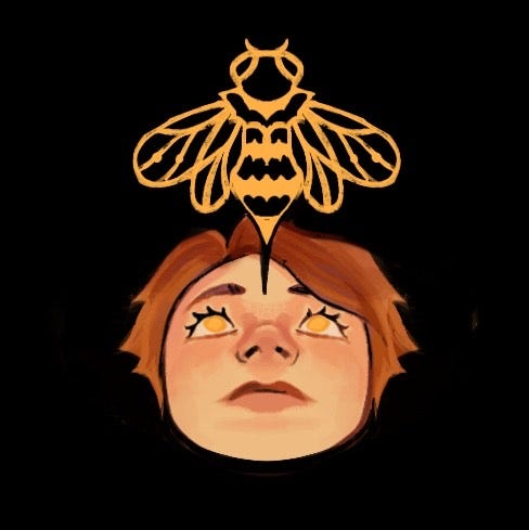
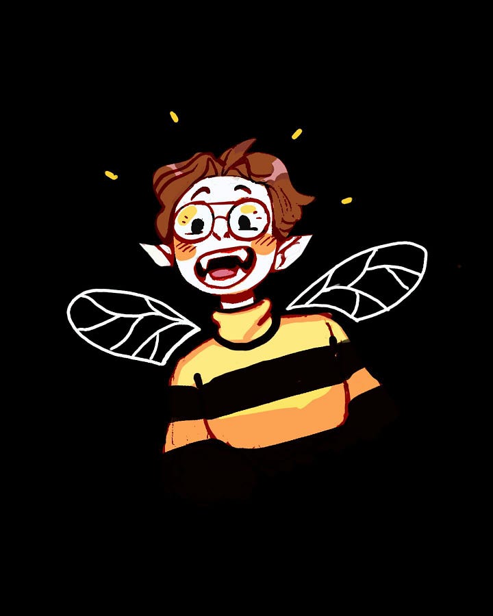
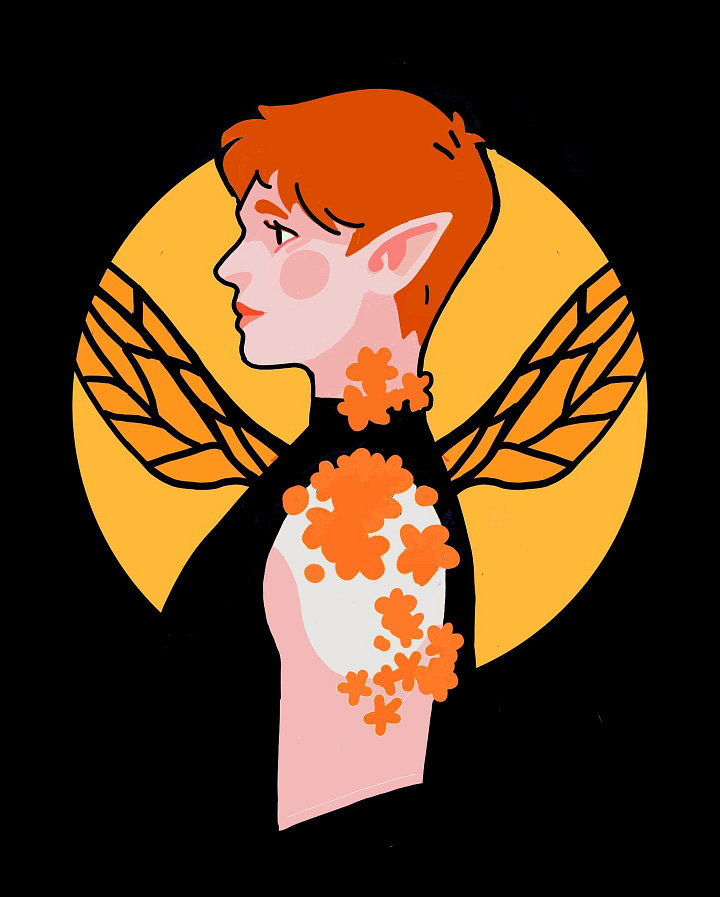
I'm a medieval art nerd. I love how animals can have symbolic meaning. I associate the parts of my life with animals. Before the bee, there was a red-breasted robin. It symbolized my family. It was innocent and adventurous and little and soft and round.
Then my friend told me I'm like a little bee because I never stay still. It's my worst flaw and my best virtue. In the good sense, I am always very curious and enthusiastic. On the other end, I’m trying to learn to slow down and smell the flowers. Also, my friend told me I have a brain hive: sometimes it's very organized chaos and it functions. But sometimes it's just noise and buzzing. I also have never had a community around me, like in real life, a community of queer artist friends. So I like the idea of someday finding my hive or some other bees to buzz with.
Reaching Out for Jukebox
What are helpful things to include when someone reaches out about a project?
Someone comes off as professional if they include:
This is my timeline
This is my budget
And something about goals
Timeline is important because, being a freelancer, you have multiple jobs. So it’s very nice to have someone who out of the get go does the awkward timeline and budget talk.
I also want a sense of how important the project is to you, especially with indie developers. It sounds very cheesy, but it's the best part about working as a freelancer. I like seeing that they know what they're talking about and they know what they want. I know that if I see a passion in the commissioner, it gets a plus from me. I get passionate too.
What do you consider a “red flag” when someone reaches out to you for a commission?
It's mostly an instinct and email etiquette. If they don't talk about budget or timeline, I don't know if I'm talking to an actual professional person or just a person asking me about a project they're not serious about.
It’s okay to contact via social media, which people have done with me for professional engagements, but then you need to include a professional channel, like a professional email. Eventually connecting on a professional channel is important.
Another red flag is getting the sense that the message was copy-pasted. I mean, I get it. It's a business, but also it's not a great feeling.
Let’s talk about that structure as it applied to Jukebox.
The number one thing that got me to do this commission specifically, which is golden, is that you gave me so much to start with. Like I could feel my brain gears turning as I read the document. Having so much to start with saves you so much time and gives you a solid foundation. You don't lose time asking questions that have already been answered.
EXAMPLE: Here’s the instructions I provided Lia
Jukebox Cover
Size and Format: 300 dpi digital image meant for fitting with bleed to Mixam’s specification for digest (5.5 by 8.5 sized with bleed) for outer cover in CMYK color
The image should be 6.5 by 5.5 (not accounting for bleed) because of the yellow header see below:

Content and Style Goals: Jukebox is a game about Broadway and movie musicals and musical storytelling. The goal of the cover art is to express:
The game is about musicals and musical storytelling.
The cover looks like an image that could be on a playbill (examples below).
The color scheme, poses, and expressions are dynamic, dramatic, showy, and exciting.
The game can be played in a variety of genres.
See Style Inspirations and Cover Concepts for some ideas, but this would involve including multiple people or icons in the image to represent this.
This game is for everyone.
A mix of individuals is represented on the cover.
Style Inspirations


Left to Right, Top to Bottom, this is:
Corrupted Tarot 2021 by Iliadele (this piece was how I found Lia’s work)
Cover Concepts


Okay, back to the interview…
Lia's Design Process
What’s your process for a game or tabletop-related commission?
I split the project in three phases:
The first phase is an analysis and research.
The second phase is the concept and the pre-production.
And the last phase is the application or the production.
It's not rocket science, but it’s flexible and applies to many different commissions. For example, if someone asked me for illustration work, I would ask them a bunch of questions: what you want, what's the world, what’s the story. In professional settings, there's also the part where you talk about the contract.
Step 1: Analysis and Research
Tell me about the research phase and the visual references for the Jukebox cover:
Your document had a bunch of Broadway playbill examples and other examples which helped with ideas for the composition, but also to understand the objective. That objective was to make a cover for a TTRPG that must be:
Vibrant, and it must be clear
Diverse in the characters
It has to have a vintage kind of feel
And it has to be clear that it's about musicals and about singing
So these were the four main points. Then, I analyzed my style and came up with three options.
First, I said, okay, I have experience in doing vintage-style illustrations. There’s the Pin Up painterly style, which is common with artists such as Haddon Sundblom and Mead Schaeffer. So I was thinking a golden age of illustration-esque piece, but with softer colors and softer blending, more realistic, even though our style wasn't going to be realistic portraiture, with a material feel to it.
Then I suggested a more aggressive, punky, rougher style, which was much more common in pulp magazines and early rock posters. Like the public theater posters, which are very vibrant, visually striking in silhouettes, and very colorful.
And then the last style suggestion was a play on monochromatic with one accent color. This was very common in magazines in the 60s and 50s. These were two-tone pieces with the screen tone effect of chromatic aberration, which was pretty common because there were mistakes in the printing.
EXAMPLE: Here are the Playbill images I provided Lia
Reference Playbills


Some Like It Hot: I like the iconic/styles nature of the figures, the gradient shading, the color scheme, and the retro vibes.
Heathers: I like the bright colors and retro/pop art style. I think either more realistic figures in this style or more stylized figures from Some Like It Hot.
Beetlejuice: Similar to “Some Like It Hot,” this features a more stylized creature.
Rent: The Rent playbill has “squares” showing the different characters. We could do something similar with different genres, characters, icons.
Iconic Playbills


Pictured above are the Playbills for Kinky Boots, Phantom of the Opera, Wicked, and Hamilton. They are both “iconic” in that they are well-known musicals but are also very simple, with bold, stylized images.
Step 2: Concept and Pre-Production
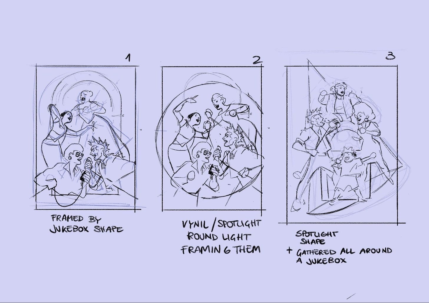
We had two different concepts: four characters in an action pose and a three-by-three grid of squares. We decided on the squares. Then, we iterated on the characters in the squares.
What was your experience like when iterating on those characters? I know you mentioned the Gorillaz cover as an inspiration for that.
Yeah, I like the composition we chose. I like the idea of panels not being rigid. I love when comics do that, that maybe a character is going outside of the panel.
For the characters we chose, my research involved watching a lot of musicals, so much that I messaged my friends, telling them “I think this commission is making me a theater nerd”.
I love that you underlined the aspect of diversity and we tried to be as inclusive as possible. It was very fun to draw characters that I don't usually draw like the old man, the young kid, the animals, and people from different cultures. For the Bollywood character, which is very simplified now, she’s actually the product of watching a lot of Bollywood movies and gets zooming very close on the costumes.
These characters are separate units, but they’re also interacting: looking at each other or pointing at each other.
EXAMPLE: Choosing the cover concept
I suggested two cover concepts to Lia, one was an action shot with a few characters, the other was a grid of faces:


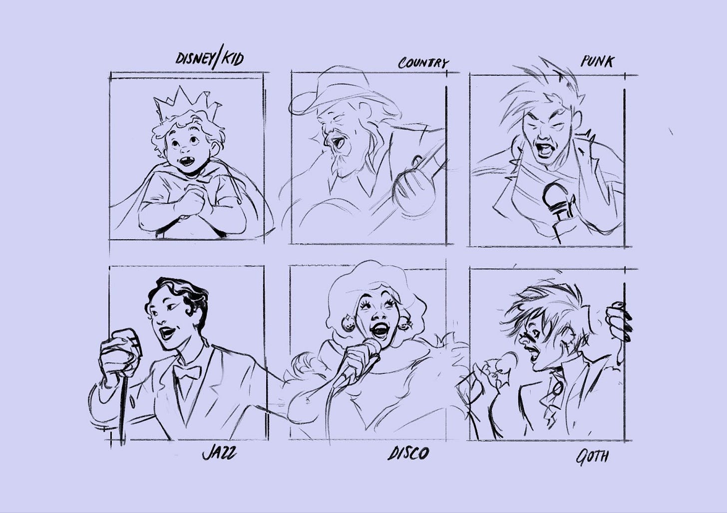
From that, Lia provided some concept sketches:
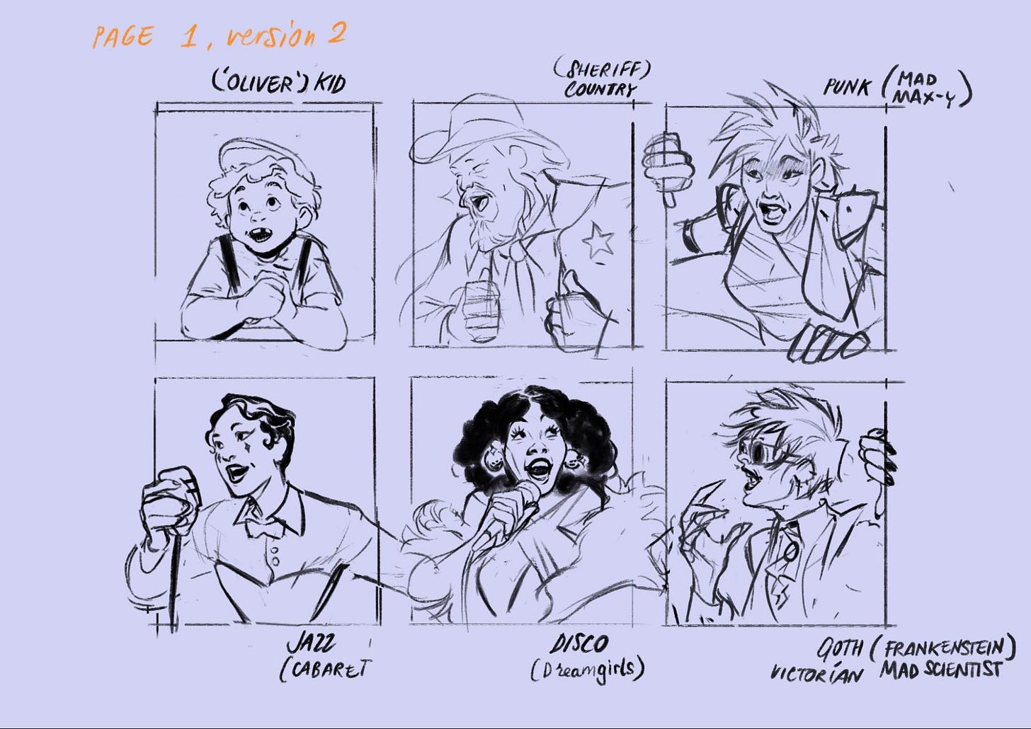
For both concepts, I knew I wanted a mix of characters (ages, races, genders). Lia came up with a list of musical character tropes. They did sketches of the different characters. I ended up polling my friends on which characters they liked to pick the final 9 on the cover.
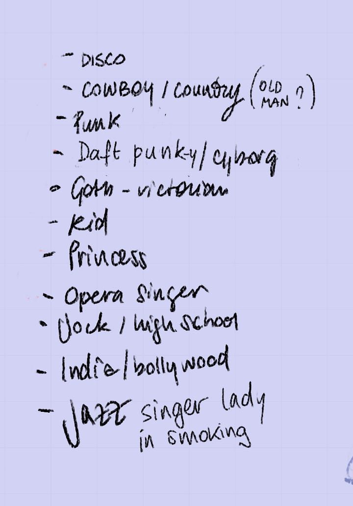
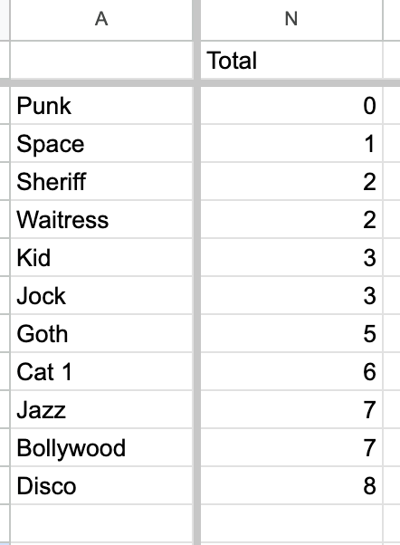
Here is a second draft of character concepts:
Then, they blended the final cast of characters we picked with the different style concepts:
I ended up choosing the middle "posterized" example as the direction for the cover.
Step 3: Production
What advice about communication during the production process would you give new artists?
Read everything and summarize it in bullet points.
Then, if something isn't clear, just ask. It’s scary, but just ask “is this what you had in mind?” And provide as many examples as you can when asking for clarification.
Then set up a baseline of communication that's comfortable for both people. You might do video calls or maybe just giving everything via email or just working on Google Docs with comments.
Be very clear on communication expectations. I am in Europe and I work mostly with US clients so there is a time difference there. I cannot respond right away because maybe when someone writes to me I'm getting to bed or it's very early in the morning.
Also, if you are uncomfortable with something in the communication or if you need something, just say it. Say when your working hours are and when you're not available. And if people get mad or treat you badly, if there's a reason, like maybe you were unprofessional, self-reflect. If it's on them, then it's on them. It's something that I have to repeat myself because it's tough to remember sometimes.
How did you do final production and picking the colors?
By then, everything is pretty much decided on so the path is pretty clear.
For Jukebox, what really pushed me out of my comfort zone were the colors, which were way brighter than I'm used to. I really stretched my color theory brain. I sent the picture to a bunch of my devices to see the differences. And I asked my best friends for advice.
There was also the matter of trying different color profiles. Between CMYK and RGB, the difference is pretty striking. If you work first in RGB and then on CMYK that's tough. The colors change dramatically.
But if you start in CMYK for print it’ll work for web. It’s trial and error figuring and looking at a bunch of screens. The last bit of challenge was figuring out how much to push the colors and the textures and how much to reel it in. I found that it’s mostly okay to work in RGB and then convert it but have a proof of colors in CMYK ready at various stages, so that you can check everything reads nicely.
The colors were the scariest part for me, because I didn’t have a vision for them. And when you submitted your original colors, I was worried they were more muted than I wanted, but I didn’t have any other suggestions.
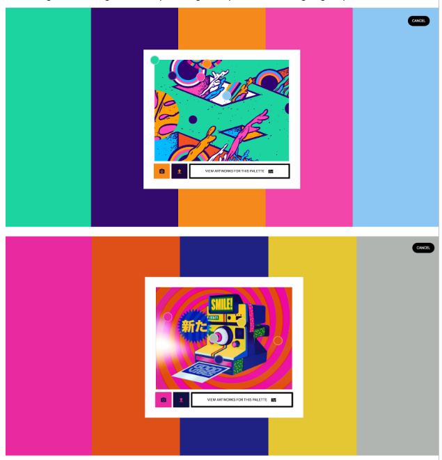
You suggested using Art Palette, a program that pulls color schemes from an image. From that I found a bunch of pop art images and found a scheme that was similar to the one you initially suggested. And then it ended up as a blend of those two color schemes.
Two lessons I would take from that:
References are great
And tryouts are great
References can remove scary uncertainty.

Tips for Working as (and with) Artists
Did you like working in Discord or in a Google Doc better? I tried to move content out of Discord and into a Google Doc to keep track of decisions.
That was great and surprisingly proactive on your part. Having this place to refer to and get all my files and ideas was good for the project.
Another good point to make to your employer, if you're an artist, is how precious to be with progress shots? Do you have to save time lapses? Very, very early on you have to make that clear because if you don't save the progress shots and just have the final piece, the evidence of progress on it won't be there. Being clear will save you a lot of backtracking.
What are some of the biggest lessons you’ve learned about the business side of freelancing as an artist?
Three things:
Fan art will get eyes on you. That's a fact. There's nothing wrong with doing fan art, I mean three fourths of art history is just fan art of the bible. You should get invested in something that you care about. It doesn't matter if it's silly or niche. I am crazy about the history of armor. Who cares about that? But there are people who care about it. Something I keep in mind is a quote from the artist Dawn Carlos: “Don't do what you think you should do, just do what you want”. ( I think it’s from something Ian McQue told them). So don't feel bad for doing fan art, and don't do fan art that you don't really care about just for the likes. People see that you don't have passion for it. It's weird, but they do.
Second, you will be asked for less than what you're worth. It’s the nature of freelancing. It's usually because artists don't know how much to ask for or they don't know how to communicate, through no fault of their own of course. Talk to artist friends, look at how much others are asking for, and you will learn how to price your work in time.
Third and most important, is network, but in a genuine way. Do not command people at cons or on DM. Just tell them “Hey love your work” and if you’re passionate about a project tell them and hint that you’re an illustrator. In the worst case scenario you just came off as a kind stranger. Win-win.
Can you tell me more about how you network as an artist?
I'm not shy, but I'm an introvert. But I have this policy that when you're saying a nice thing, if you feel like it, just comment on it, or tell the person who made it.
I also have this thing when I'm feeling down, I go to my Twitter likes or things that I've saved on social media. And I go to the artist and I make a nice comment. Maybe you feel better and you make the person feel nice too.
Praise is underutilized. It’s free to say thank you and express excitement about somebody’s work!
Also the internet can be so negative. Having that little circle of mutual friends also online is important. We have “networked” but basically they're my friends and colleagues. We have not met, but there’s a level of familiarity and it's nice to just be aware of them and their work and to be positive with the smaller community. In this big, wide, hostile, and ungraspable, inconceivable mass of people and words, it's nice to have a small niche of people that you just say, “Hey, nice!”
What's next for you? What are you working on?
I'm in a bit of a transition moment, I have a move on the horizon and am investing in my community more, going to protests and being active. I’m also working on personal projects with some experimentation and some self-indulgent art. I am looking forward to showing the work for Bad Bishop when the game comes out. Also, I'm writing! I have written two fairy tales, and I want to illustrate either one of the two fairy tales or a poem that I've written that's based on a grim fairy tale.
The internet is on fire, but you can find me anywhere as Iliadele or Iliadeleart on Twitter:
I'm way more active on Instagram. I'm taking a little bit of a break from social media right now, especially Twitter. I often post art on Instagram stories, like sketches and stuff behind the scenes. My email and everything else is also linked on my website.
Thank you so much Lia! Thank you so much for the beautiful Jukebox cover, for which the initial sketches made me cry. And thank you so much for your time for this interview!
The Final Cover: Before and After
And one more time, the link to the Jukebox Kickstarter:
Over and out,
🫙 👁️ 👁️


